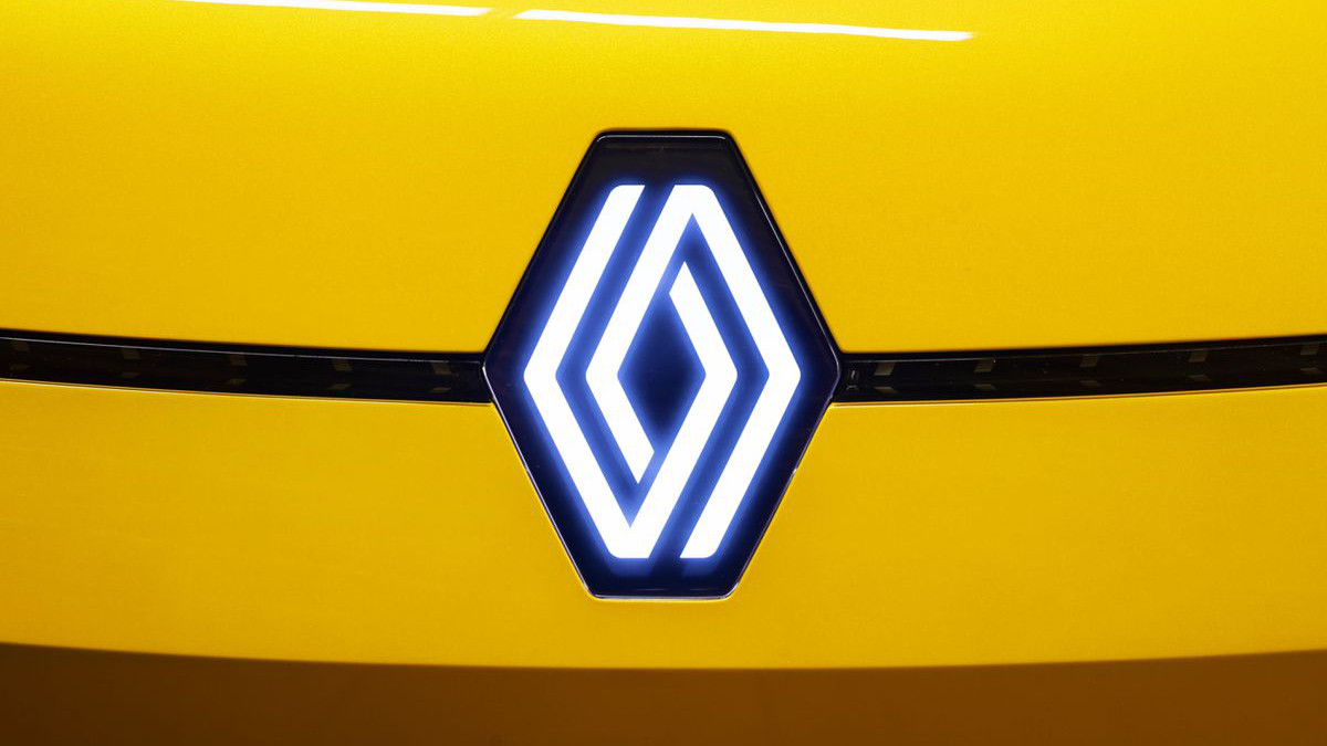
Renault has officially unveiled its updated diamond logo. Originally displayed when the company’s ‘Renaulution’ strategic plan was announced in January, the new logo will be gradually applied to Renault vehicles launched next year before making its way across the entire range by 2024.
Renault has changed its visual identity nine times since 1925, but the diamond shape that serves as the basis for the logo has remained. The company said the logo was updated because it felt that the previous design, which was created in 1992 and redesigned in 2015, was beginning to date.
“To meet the challenges of a modern international brand and the multiplicity of its fields of expression, notably digital, a new version has been under development since 2019,” the company said. “Uncluttered and with no signature or typography, the new logo features a flat, two-dimensional treatment to facilitate use on video and digital media, as well as on vehicles.”
“We have integrated it on the Renault 5 Prototype for the first time,” said Renault Design Director, Gilles Vidal. “It was, for us, a formidable testing ground. In view of the enthusiasm and the very positive feedback we received about the logo, we decided to launch it.”

Vidal said the diamond shape fundamentally embodies Renault.
“We have re-thought it to become more iconic, simple and meaningful, a true timeless signature, without superfluous effects or colours, with a contemporary takeover of the lines, an essential part of our graphic heritage,” said Vidal.
